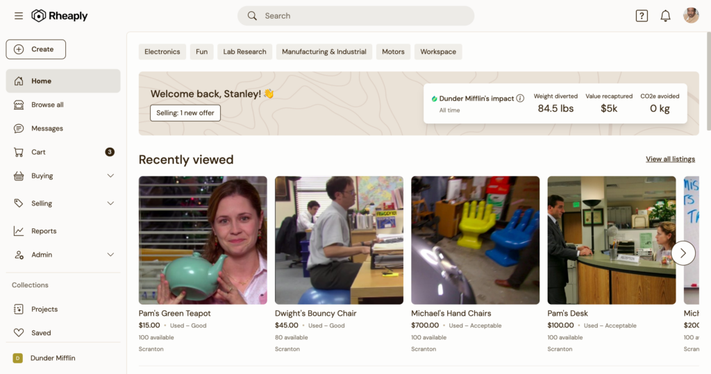
Say ahoy to platform navigation upgrades!
We just launched a brand new design and structure for our platform navigation! Dive into all the changes (and rationale) behind it.
A nav (or navigation) is typically that bar you will see on the top of a website with links to take you around the site. It encompasses the structure of how the site is organized, the terminology used, and the actual look & feel.
Why did we do this?
We listened to users and clients like you! Across multiple Customer Advisory Board sessions and feedback shared from clients and users, we gathered all of the problems and opportunities to drive forward this new design.

What’s new?
- Side nav – you’ll immediately notice the nav is now mostly on the left side. As our product grows, we continue adding on new pages. Putting the navigation on the side of the window provides more space to add items in the future. You’ll also notice pages like Cart and Messages have moved into the side nav as well. In order to centralize the top pages, we put all the important stuff in the side nav. Utilities like your profile and notifications will still remain in the top right.
- Exchange Center → Buying / Receiving & Selling – we’re breaking up… the Exchange Center – yes, that’s right. The old Exchange Center has been replaced by two new top-level nav items: Buying / Receiving & Selling.
Browse all – we added a new item to “Browse all,” which lets you get right into the marketplace and see everything available to you. - New help menu – there is a new help menu with links to chat, visit the help center, and submit feedback. The goal here is to be more helpful!
Anchors away!
If you’re a Rheaply user, be sure to log in and check out the new navigation. Not a Rheaply user?


